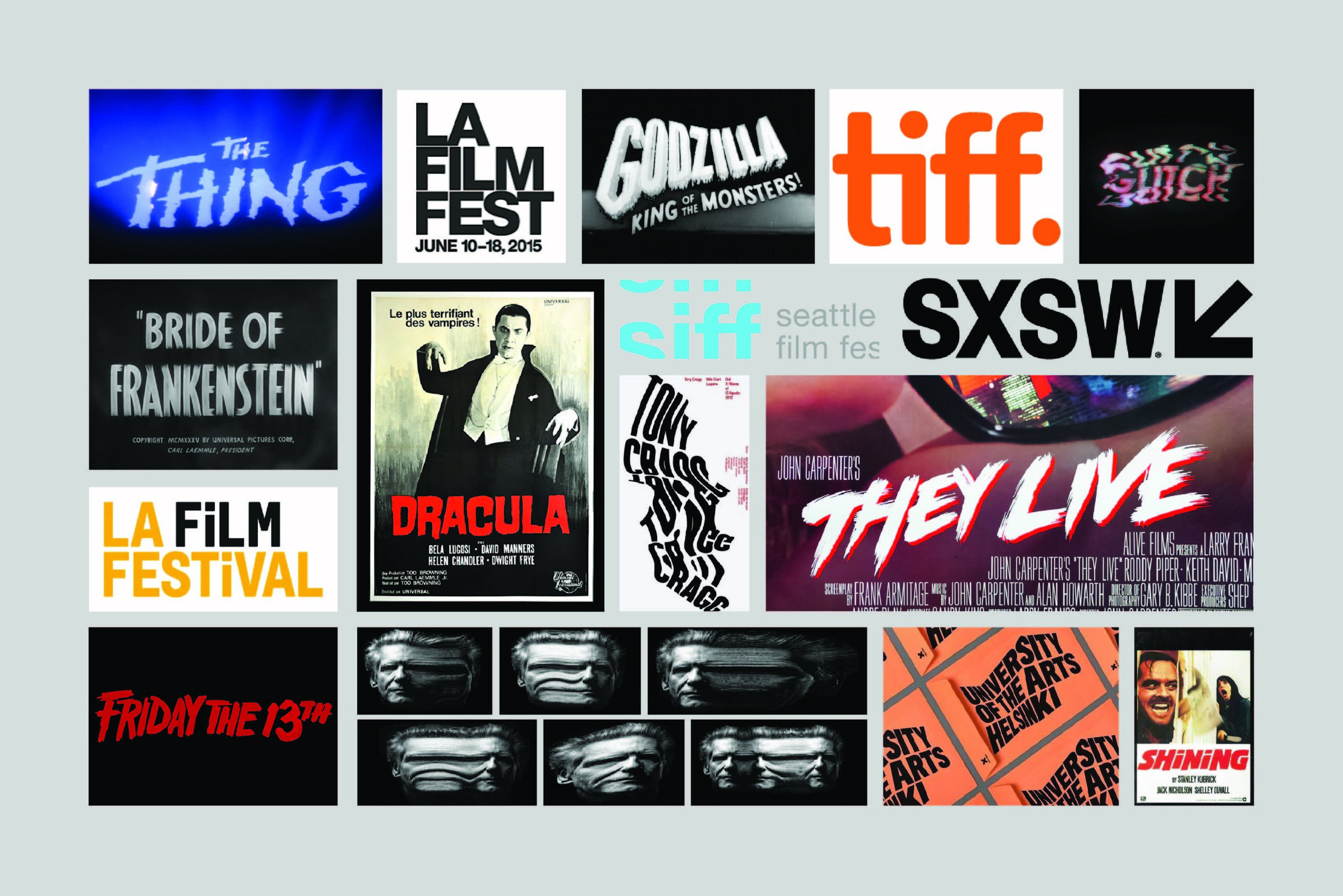
ATLANTA HORROR FILM FESTIVAL REDESIGN
Updated logo and branding to modernize Atlanta Horror Film Festival’s look and feel. The final logo is a combination of a refined, typographic solution mixed with an organic, bloody slash to represent the gore and element of surprise in horror movies. The italic font and slash both suggest movement. This is important to convey in the logo because of the frenzy and excitement associated with the horror movie genre. This logo is versatile: the color can change to suit the brand collateral and is successful when enlarged on a banner or reduced to fit on a business card or an app.


